JetSweat - Mobile web responsiveness
Jetsweat is an online fitness platform where you can stream online boutique fitness classes.
My role
Product designer
Product
Make an offer on car listings
Tools used
Figma, Miro
Time
Jan 2023-June 2023
The problem
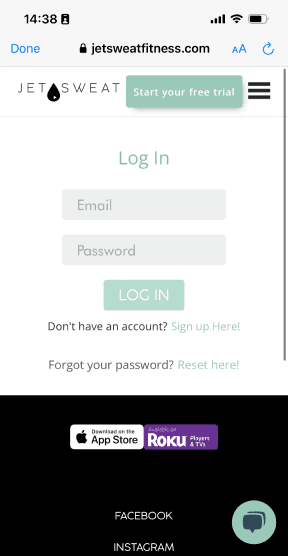
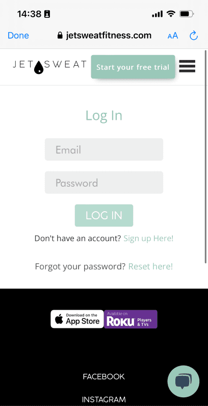
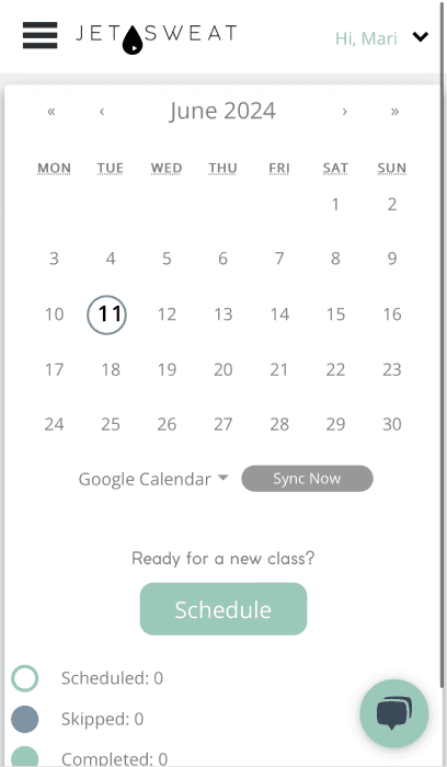
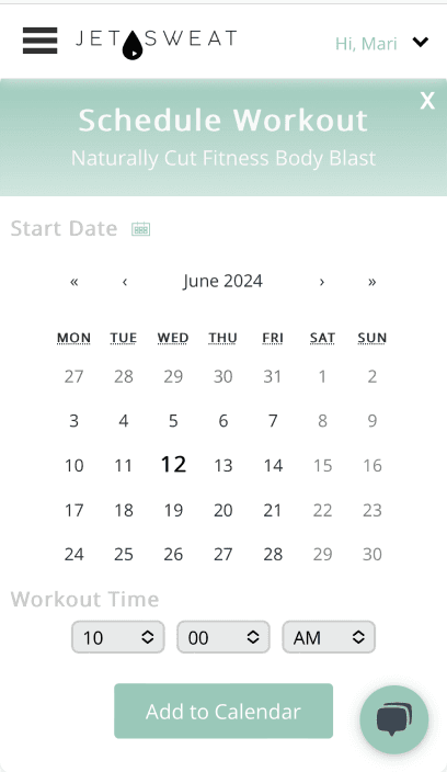
The responsiveness of the mobile web wasn’t user friendly, so it was important to audit all the pages to understand the scope of the work and note future improvements for later value drops.
Why?
Although the majority of JetSweat’s users use the website or app it is important to always ensure the mobile web is functional.
Audit
First, I needed to perform an audit, this was beneficial for many reasons. Familiarizing myself with the product, noting user flows & scenarios, and of course the lack of mobile responsiveness. The audit was then presented to stakeholders where we priortized pages to work on first.
Example of audit slide deck
Wireframes
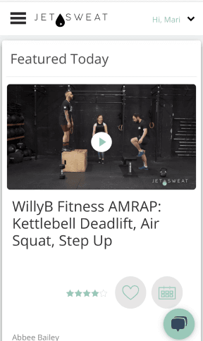
We prioritized the dashboard page first, why? Because the dashboard page is the first and most view pages users come to, it is where they can find featured classes, track their week and more.
I wireframed out the dashboard page and then presented to the respective stakeholders for feedback and to understand any technical constraints.
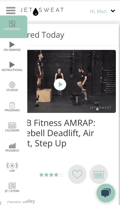
Featured today
Title of the video
Instructor name
17 Mins
100-200 Cal
Dumbbells, Yoga Mat, Resistance Band
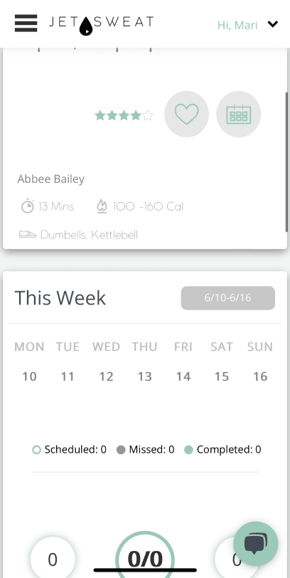
This Week
6/17 -6/23
MON
10
TUE
10
WED
10
THU
10
FRI
10
SAT
10
SUN
10
Scheduled: 13
Missed: 13
Completed: 0
0
Calories
0/14
Progress
0
Minutes
Recommended Classes
See All
Box and flow Turn Pain into..
17 Mins
10- 20 Cal
Dumbbells, Yoga Mat, Resistance Band
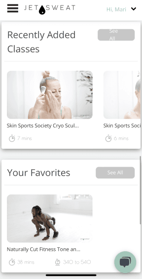
Your Favorites
See All
Box and flow Turn Pain into..
Time
Calories
Equipment
Recently Added Classes
See All
Box and flow Turn Pain into..
Time
Calories
Equipment
Just for you
See All
21-day healthy habit challenge
100-200 Cal
3 weeks and 7 days per week and 6 - 58 minutes
History
See All
Start working out with JETSWEAT!
Your past classes will appear here.
No Equipment
See All
Box and flow Turn Pain into..
Time
Calories
Equipment
Designs
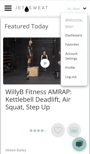
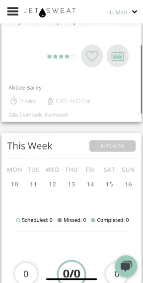
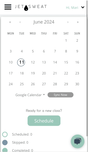
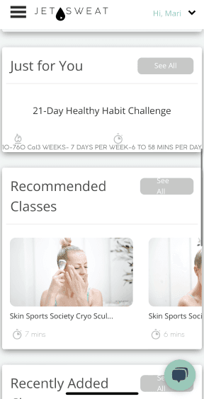
Once the wireframes were signed off, I used them to create high fidelity designs. I presented the designs once more to stakeholders then noted developer notes for handover. Once I shared the designs to the developer I moved on to the next page on our list.
Learnings
As a designer it is important to prfioritize a user-friendly mobile experience, even if it isn’t there isn’t much traffic on the mobile web experience. For this reason, I always start my design process with a mobile-first approach.
Designing for the smaller mobile breakpoint first will help ensure the content fits, making it easier to design for larger breakpoints.
I enjoyed this design process, it was good practice receiving consistent feedback from stakeholders, using auto-layout for the final designs, and more experience with handover to developers—all things that I’m passionate about.
